Generate Safe Text Colors with Sass
Reading time: 3min
One of my tasks at a previous job was to abstract out the process of theme creation for the company's product.

The Goal: Give our users the most power without dropping the kitchen sink in front of them.
Currently, there are 10 different colors that can be defined by a user (background/text/button/progress/etc). My assertion is that the time it takes an average user to create a palette of ten colors that looks even passable, far outweighs the benefit of such granular control. (Lord knows, you shouldn't have 10 completely different colors on one page)
The Idea: Cut back user input to 3 colors and programmatically create logical ancillary colors.
Colors defined by the user:
$primary: #333;
$secondary: #fafafa;
$accent: blue;
Note: I will be using Sass throughout this article.
The first case I decided to tackle was our buttons. I needed to make sure that the button text was always easily readable over the button's background color.
The first method that came to mind was to make use of the powerful color
functions within sass. Using the darken() function I could
create a text color that is, say, 40 % darker than the original color quite
easily:
$color: lightblue;

button {
  background-color: $color;
  color: darken($color, 60%);
}
Not too shabby. We've got a light blue background, and a nice dark text that still has a hint of blue.
The first issue
I immediately ran into an issue. Because we have no restrictions on the original
color (lightblue in our case) a user could potentially set the base color to a
dark color like black. Of course darkening our text color won't help us at all
in this instance.
This time we can make use of the Sass lightness() function. This will return
the lightness value of the color (a numerical value between 0-100). The function
below tests for the lightness of the initial color and will lighten or darken
our text color depending on that value.
$lightness-bound: 70 !global;

@function checkLightness($color) {
  @if (lightness($color) > $lightness-bound) {
    @return darken($color, 60);
  } @else {
    @return lighten($color, 60);
  }
}The second issue
What if the user sets the initial color to yellow? While true yellow is below our threshold for lightness (yellow comes in at 50% lightness), a lighter text will still be incredibly hard to read. Yes, we all hope they don't use bright yellow...but, we both know someone will.
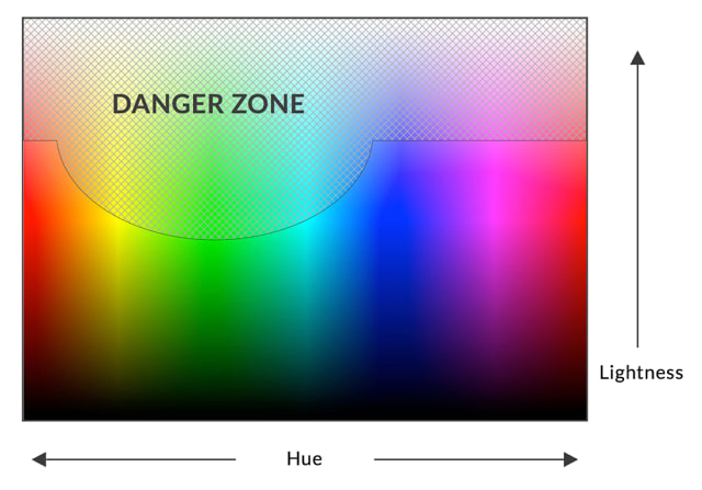
After trying color after color I came up with what I call The Danger Zone of the HSL color space.

Lightness is defined on a vertical scale from 0 to 100 while Hue is defined on a horizontal scale from 0° to 360°.
We need to know when a color lands in this 'danger zone' and when it doesn't. When the initial color is within the danger zone we will darken the text color, and when the initial color is not in the danger zone we will lighten the text color.
$lightness-bound: 70 !global;
$hue-bound-bottom: 40 !global;
$hue-bound-top: 200 !global;

@function checkDangerZone($color) {
  @if (
    (lightness($color) > $lightness-bound) or
      (hue($color) > $hue-bound-bottom and hue($color) < $hue-bound-top)
  ) {
    @return darken(desaturate($color, 70), 60);
  } @else {
    @return lighten(desaturate($color, 50), 60);
  }
}
You will notice that I have also added the desaturate() function to this
solution. This tones down the actual color (yellow/red/etc.) and allows our
darken() and lighten() functions to move our text color closer to white or
black. (I rarely see a use case for light red text on a dark red background.)
Play around with the final function in another SassMeister Gist.
There it is. A sass function that will return a safe text color for any background color.
For further learning check out SassMe to see the Sass functions I use in action.